Creating Circle Graphs
Drawing a Circle Graph
Santo surveyed \(20\) of his neighbours to determine what type of water they drink at home. The following table shows his survey results.
| Type of Water |
Number of Houses |
| Tap Water |
\(13\) |
| Filtered Water |
\(5\) |
| Bottled Water |
\(2\) |
Since type of water is categorical data, Santo decided to create a circle graph to represent the data.
He drew a circle, and divided it into \(20\) even slices, so that each slice would represent \(1\) of the \(20\) houses that were surveyed.

To determine the portion of the circle that represents the tap water users, Santo started at the top of the circle, and counted out \(13\) slices, to represent the \(13\) houses that use tap water.

He labeled this section Tap Water.

To mark off the portion of the circle that represents the filtered water users, Santo started from the edge of the tap water, and counted \(5\) slices to represent the \(5\) houses that used filtered water.

He labeled this section Filtered Water.

This left the \(2\) slices that represent the \(2\) houses that use bottled water.

Santo labeled this section Bottled Water.

Notice that all of the \(20\) slices of the circle have been used, which indicates that we have included all of the \(20\) houses that were surveyed.
Santo can finish up his circle graph by adding a title, "Drinking Water Type By House."
Drinking Water Type By House
If he chooses, he could add frequency or relative frequency data to each category.
Notice that Santo started with the Tap Water group, which was the largest group. When creating circle graphs, I often start at the top of the circle, with the largest category. And then order the categories from largest to smallest, as I work around the circle in a clockwise direction.
Not all circle graphs are created in this manner. But this method will ensure that categories that are similar in size will be close together, and make for easier comparisons.
Check Your Understanding 2
Question — Part A
The choices of \(25\) campers at a summper camp are shown in the table below.
| Lunch Choice |
Number of Students |
| Sandwich |
\(3\) |
| Pizza |
\(21\) |
| Hot Dog |
\(1\) |
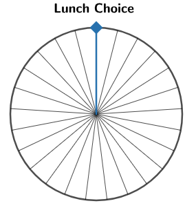
Divide the following circle graph into the appropriate number of slices.
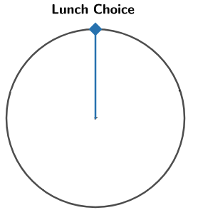
Created with GeoGebra. Author: University of Waterloo. CC BY-NC-SA 4.0. https://ggbm.at/x8XKP54m
Answer — Part A
The circle graph is divided into \(25\) slices.
Feedback — Part A
Remember that the number of slices should be equal to the total number of campers.
Question — Part B
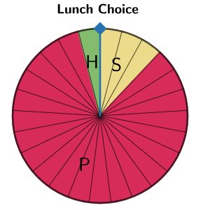
The choices of \(25\) campers at a summper camp are shown in the table below.
| Lunch Choice |
Number of Students |
| Sandwich |
\(3\) |
| Pizza |
\(21\) |
| Hot Dog |
\(1\) |
Using the circle graph with the appropriate number of slices from part a), display the data from the table in a circle graph.
Created with GeoGebra. Author: University of Waterloo. CC BY-NC-SA 4.0. https://ggbm.at/x8XKP54m
Answer — Part B
The response Sandwich takes up \(3\) slices, Pizza takes up \(21\) slices, and Hot Dog takes up \(1\) slice.
Feedback — Part B
Remember that all the slices in the graph must be used and that the number of sections for each category in the graph should match the corresponding number in the table.
Online Version
https://ggbm.at/x8XKP54m
360 Degrees in a Circle
Create a circle graph for the data from a survey with \(120\) participants.
I'm not very excited to divide a circle into \(120\) even pieces. That would take quite a long time and would be challenging to do accurately. Thankfully, we can use another strategy using our knowledge of circles.
When you turn all of the way around once, you have completed a \(360^\circ\) turn.
We can confirm this by using our knowledge that a quarter turn is \(90^\circ\).

To turn all of the way around, we can do four quarter turns, or four \(90^\circ\) turns to return back to our starting point.

This means we will have turned \(4\) times \(90^\circ\), for a total of \(360^\circ\).

You may have also heard of a full turn being referred to as a 360 in sports such as skateboarding, snowboarding, BMX freestyle, and other trick sports.
If a full circle represents \(360^\circ\) and a survey had \(120\) participants, how many degrees of the circle will each participant's response represent?
\(360 \div 120 = 3\)
Therefore, with \(120\) participants, each response in the survey represents \(3^\circ\) of the circle.
Let's use this value to help us create a circle graph for a survey of \(120\) people.
A Survey of 120 Participants
\(120\) participants were asked to name a food that you would eat with the skin on.
Here are the frequency of their responses.
| Response |
Frequency |
| Chicken |
\(30\) |
| Apple |
\(50\) |
| Potato |
\(25 \) |
| Peach |
\(15\) |
Recall we determine that
With \(120\) participants, each participant's response will represent \(3^\circ\) of the full circle.
\(30\) participants chose chicken. Since each response represents \(3^\circ\), we have \(30\) times \(3\), or \(90^\circ\) in total. So the response "Chicken" represents \(90^\circ\) of the circle. We can put this into our table.
| Response |
Frequency |
Total Degrees of the Circle |
| Chicken |
\(30\) |
\(30 \times 3^\circ = 90^\circ\) |
| Apple |
\(50\) |
|
| Potato |
\(25 \) |
|
| Peach |
\(15\) |
|
We can use this same strategy for each of the categories.
- \(50\) participants chose apple. Since each response represents \(3^\circ\), we have \(50\) times \(3\), or \(150^\circ\) in total. So the response "Apple" represents \(150^\circ\) of the circle.
- Similarly, we can calculate that the response "Potato" will represent \(75^\circ\) of the circle.
- Finally, the response "Peach" will represent \(45^\circ\) of the circle.
We can now fill in our table.
| Response |
Frequency |
Total Degrees of the Circle |
| Chicken |
\(30\) |
\(30 \times 3^\circ = 90^\circ\) |
| Apple |
\(50\) |
\(50 \times 3^\circ = 150^\circ\) |
| Potato |
\(25 \) |
\(25 \times 3^\circ = 75^\circ\) |
| Peach |
\(15\) |
\(15 \times 3^\circ = 45^\circ\) |
Now that we know how many degrees of the full circle each category represents, we can use this information to create the circle graph.
Create a Circle Graph
We will keep our data for quick reference.
| Response |
Frequency |
Total Degrees |
| Chicken |
\(30\) |
\(90^\circ\) |
| Apple |
\(50\) |
\(150^\circ\) |
| Potato |
\(25\) |
\(75^\circ\) |
| Peach |
\(15\) |
\(45^\circ\) |
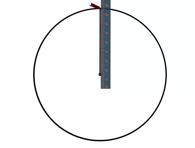
To start the circle graph, we draw a circle and mark the centre.
We next draw a line from the centre to the edge of the circle. Usually, we draw this first line straight up.
Recall that it is a good practice to start with the largest category and then order the categories from largest to smallest as you work around the circle in a clockwise direction.
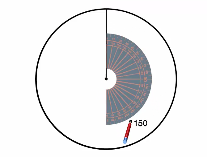
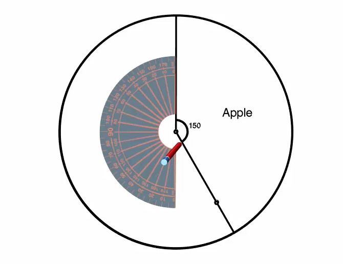
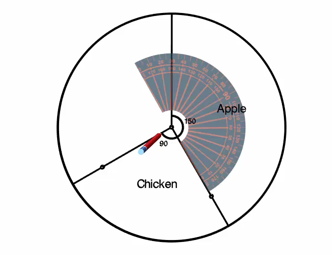
So lets start with the Apple category, since it is the largest. To measure the \(150^\circ\), we use our protractor and line up the \(0\) baseline with the centre of the circle and the line we have already drawn.
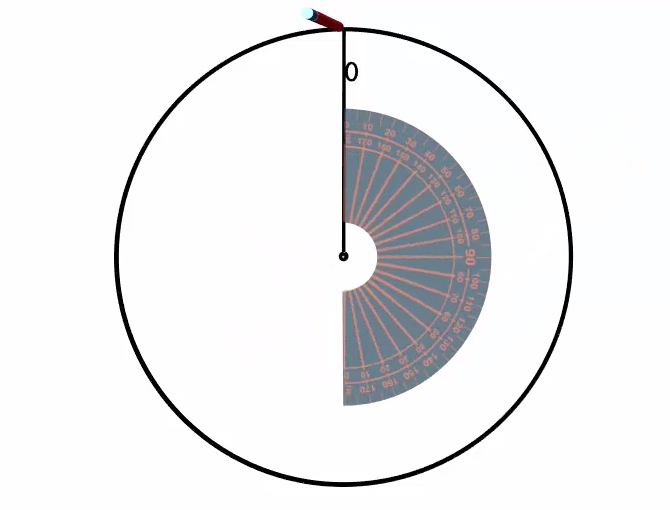
We then measure \(150^\circ\) and mark it with a point.
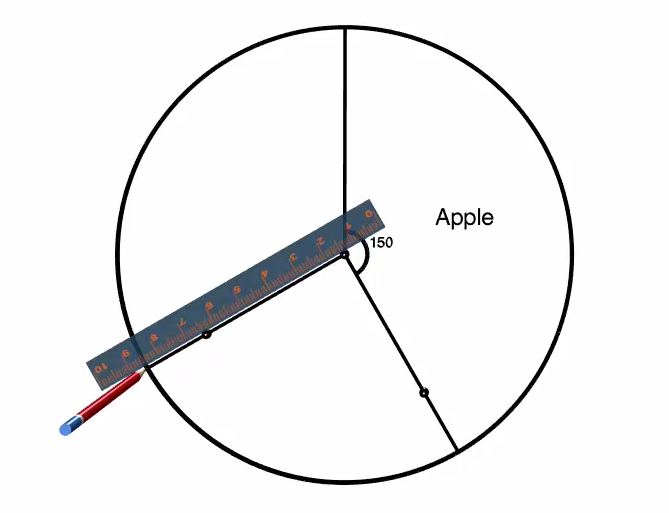
Using a ruler, we line up the centre with the point and draw a line from the centre to the edge of the circle to complete the \(150^\circ\) section of the circle.
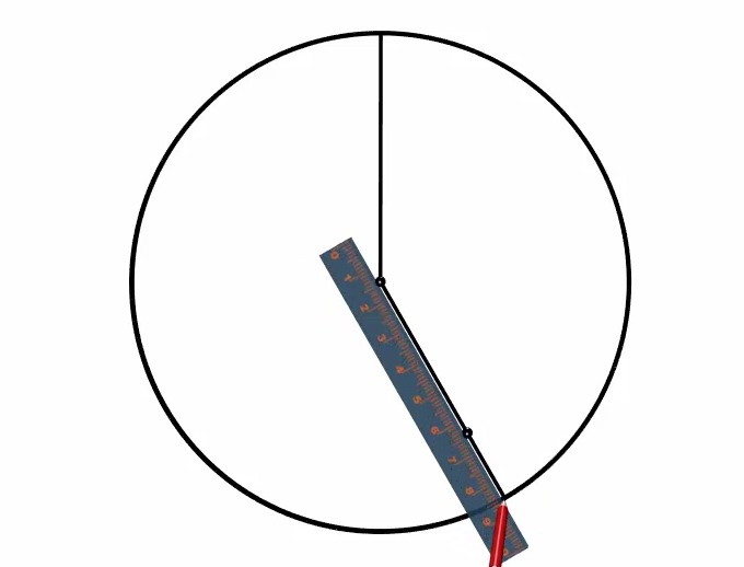
It is a good idea to label this section right away, so that we do not get confused which section of the circle corresponds to which category of our data. This section represents the category "Apple." And we can also label the \(150^\circ\) angle that we measured.
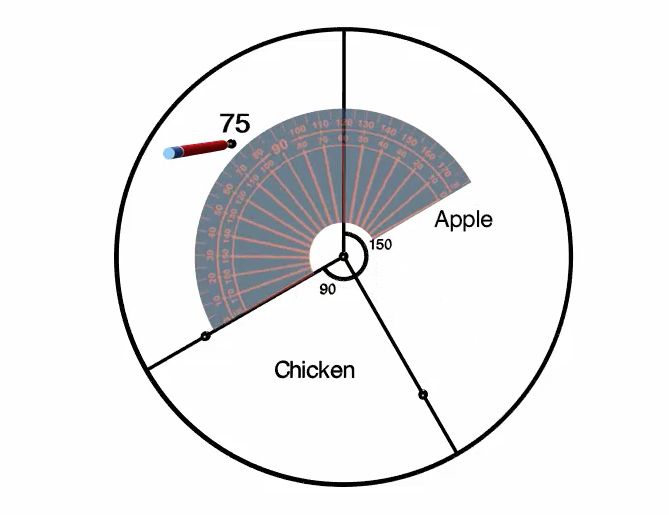
The next largest category is Chicken and it represents \(90^\circ\) of the full circle. Once again, we use our protractor, but this time we line up the \(0\) base line with the centre of the circle and the line that represents the end of the last section.
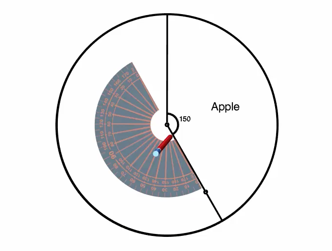
From here, we measure \(90^\circ\) and mark it with a point.
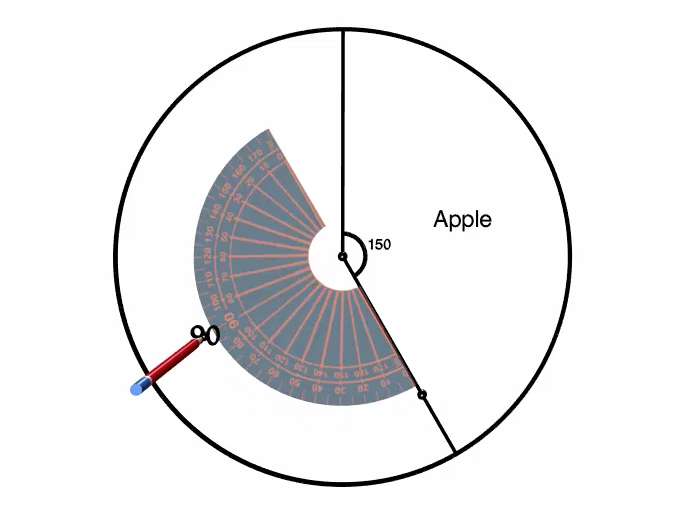
Using a ruler, we line up the centre with the point we just made and draw a line from the centre to the edge of the circle to complete the \(90^\circ\) section of the circle.
Once again, let's label this section right away with the category title "Chicken" and also the angle that we measured, \(90^\circ\).
We can repeat the same process for the third category, Potato, which is a \(75^\circ\) section of the circle.
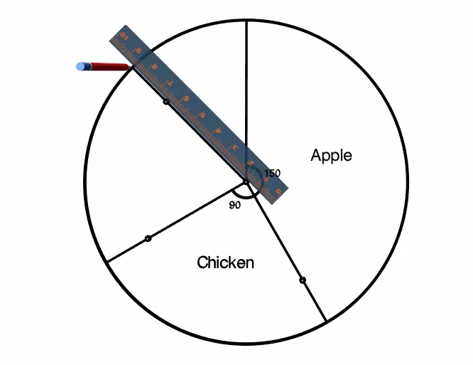
This should leave the fourth category, Peach, already measured out for us. We can add the label, "Peach" and use our protractor to confirm that the section remaining is indeed \(45^\circ\).
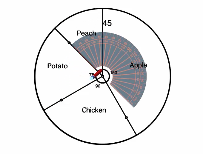
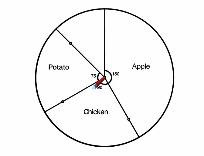
At this point, we have finished creating the circle graph. We can add an appropriate title, such as "Survey Responses" for food that you would eat with the skin on. And if we would like, we could add frequency or relative frequency data to the graph.
Survey Responses
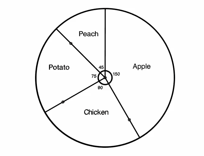
Created with Robocompass.com. Author: University of Waterloo
Check Your Understanding 3
Question
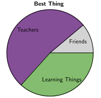
\(90\) students were asked, "What is the best thing about school?" The following table shows the results. Complete the angle column in the table to create the circle graph.
| Response |
Frequency |
Section Angle |
| Friends |
\(10\) |
|
| Teachers |
\(47\) |
|
| Learning Things |
\(33\) |
|
Answer
| Response |
Frequency |
Section Angle |
| Friends |
\(10\) |
\(40^\circ\) |
| Teachers |
\(47\) |
\(188^\circ\) |
| Learning Things |
\(33\) |
\(132^\circ\) |
Feedback
Your section angles should add to \(360^\circ\). Since there are \(90\) students, that means each student's response represents \(360 \div 90 = 4^\circ\) of the circle.
The circle graph for the results would look like the following:
Created with GeoGebra. Author: University of Waterloo. CC BY-NC-SA 4.0. https://ggbm.at/KucbsgUj
Online Version
https://ggbm.at/KucbsgUj