Misleading Axes on Graphs
Axis Labels
Here's a bar graph from a lip balm advertisement. What message are the advertisers trying to convey with this graph?

On a first look at this bar graph, the bar for Brand B appears to be about \(4\) times as large as the bar for Brand A. This suggests to the viewer that Brand B is much better than the other brand.
However, as good graph inspectors, we should always consider the axis labels and make sure they are appropriate for the data.
Notice that there is no label or scale on this graph's vertical axis.

We do not know what data this graph represents. This graph could represent the number of lip balms sold, the opinions of the owner of Brand B, or it could be the number of lawsuits each company has had. We have no idea. A graph without axes labels does not convey any meaningful information to the viewer.
Axis Scale
Here is a bar graph that was part of an article that compared newspaper sales between Company A and Company B. What message is the company trying to convey with this graph?

Source: Newspaper - Bytedust/iStock/Getty Images
My immediate reaction when viewing this graph is that Company A is clearly selling more newspapers than Company B. The bar for Company A appears to be about \(6\) times as large as the bar for Company B in the graph, suggesting that Company A sells about \(6\) times as many newspapers.
The axes labels are on the graph and seem to make sense.

However, as good graph inspectors, if we look closer at the scale, we notice that the vertical axis starts at \(450~000\). This is a very common tactic used by graph creators. By starting at \(450~000\) instead of \(0\) on the vertical axis, the difference between the two companies appears larger.

What would this graph look like if the vertical scale started at \(0\)? Let's have a look at that graph.

Notice that Brand A is still selling more newspapers, but now we see that the difference is actually not that large when compared to the total number of newspapers each is selling. What first looked like a difference of about \(6\) times as many is actually only \(1.07\) times as many, or an increase of about \(7\%\).
Changing the scale on the vertical axis of a graph can exaggerate the difference between data points.
This technique can be used by companies to make their products look much better than the competition's.
Try This Problem Revisited
Let's have a look at the Try This problem from earlier.
Graph A

Graph B

Which graph would the sales manager at the company want to use to show the company owner the improvements in sales over the last \(5\) years? Explain why you chose that graph.
Solution
Graph A is an example of a graph with a vertical axis that does not start at \(0\).
Graph A
At first glance, this graph gives the impression that the sales at this company are drastically improving each year. Clearly, this company is making positive changes that are getting results.
However, as good graph inspectors, we know that the vertical axis of the bar graph should start at \(0\).
Graph B represents the same data using a vertical axis that starts at \(0\).
Graph B
On this graph, we notice that while there is a small amount of growth, the number of sales year to year is basically staying the same.
While both of these graphs display the exact same data, each graph seems to be telling a different story about how the company did over the \(5\)-year period. The sales manager might use Graph A to give the impression that the sales staff have been improving significantly over the \(5\)-year period.
Axis Intervals
Here is a line graph that was used on a news show about gas prices. This graph shows the trend in gas prices over the last year. What message was the news show trying to convey with this graph?

My immediate reaction when I view this graph is that gas prices have been increasing slowly and steadily throughout the year.
Notice that both axes are labeled, and the vertical axis starts at \(0\). So as graph inspectors, we are happy with the scale on the vertical axis.

However, look carefully at the horizontal axis labels. Notice that the distance between last year and last month is the same as the distance between last week and today. However, these two time periods are not the same number of days.

When we create a number line, an important rule is that the scale must have consistent spacing. The same should apply for the scales on the axes of graphs.
The distance between values on an axis must be appropriate to the values of the data.
In this case, the horizontal values are last year, last month, last week, and today. The time spanned between each pair of these values is not equal. And therefore, they should not be equally spaced on the horizontal axis.
Let's recreate this graph by properly spacing this data on the horizontal axis.

This new graph tells a very different story about the gas prices. In this graph, the gas prices look to have a long, slow increase, followed by a drastic jump in the gas prices over the last \(30\) days.
A graph with incorrect spacing on either the horizontal or vertical axis can be misleading and can change the impression a viewer gets from the graph.
Check Your Understanding 1
Question (Version 1)
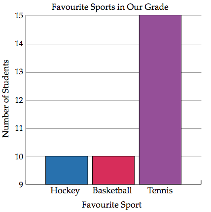
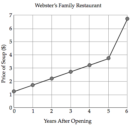
Is this graph misleading?
Answer (Version 1)
Yes, it is misleading.
Feedback (Version 1)
This graph is misleading.
We can see that vertical axis starts at \(9\), not \(0\). By doing this, it makes it look like tennis is much more popular than hockey and baseball. When we read the vertical axis, however, we notice that \(15\) students chose tennis, while \(10\) students chose chockey and \(10\) chose basketball, so in reality, tennis isn't that much more popular than hockey and basketball. Changing the scale on the vertical axis of a graph can exaggerate the difference between data points.
Question (Version 2)
Is this graph misleading?
Answer (Version 2)
No, it is not misleading.
Feedback (Version 2)
This graph is not misleading.
We can see that the horizontal and vertical axes are both labelled. They also have scales starting at \(0\) that are evenly spaced. That tells us that the graph is not misleading.